Chinese Paper Cutting Ideas for Cards and Gift Tags
Explore six modern color palettes for paper-cut cards, gift tags, bookmarks, and small handmade gifts. Choose one clear motif, one calm background, and one accent that makes the whole piece feel intentional.
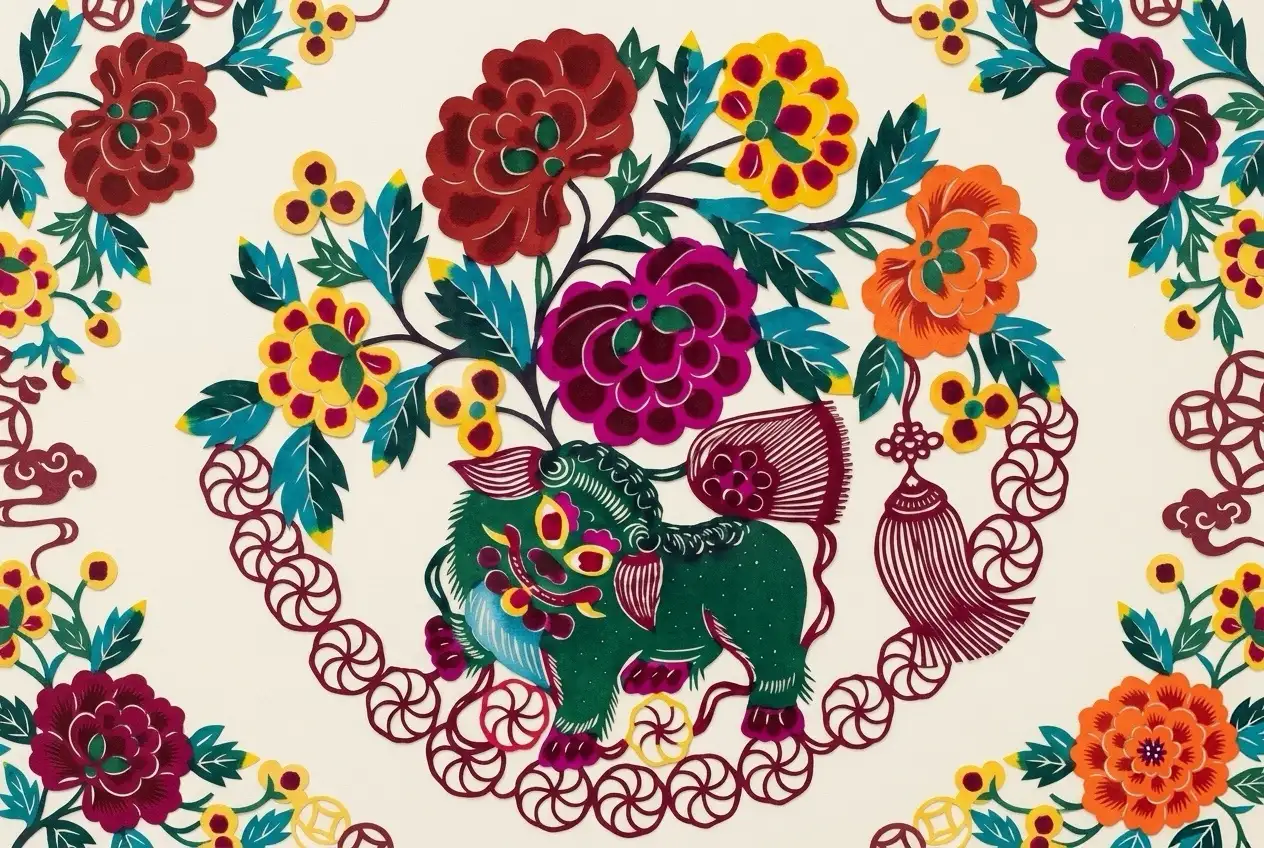
Use a Simple 3-Color Rule
For a beginner card or gift tag, start with one main paper-cut color, one quiet background, and one small accent. Strong contrast matters more than using many colors.
Ivory, cream, white, pale gray, or beige.
Flower, bird, butterfly, border, window flower, or zodiac animal.
Ribbon, tag string, message line, narrow border, or envelope detail.
Why Does a Handmade Card or Gift Tag Feel Empty?
A project often feels unfinished because the focal point, scale, contrast, or repetition is unclear. Check these before adding more decoration.
Focal point
Too much blank space or a motif that is too small can leave the eye with nowhere to land.
Try: Enlarge one motif and place it near the center, one strong corner, or the message area.
Contrast
Low contrast or too many competing colors can make the paper-cut detail disappear.
Try: Use a quiet background and return to one main color, one background, and one accent.
Connection
A tag can feel purely functional when it does not share any visual link with the gift.
Try: Repeat one accent across the card, ribbon, envelope, tag string, or wrapping.
6 Color Palettes for Chinese Paper Cutting Ideas
This is the visual core of the guide. Let one color lead instead of giving all four colors equal weight.
Classic Red + Ivory + Soft Gold
01Festive, warm, and immediately recognizable.
Indigo Blue + White + Soft Gray
02Calm, clean, and contemporary.
Dunhuang Ochre + Teal + Clay Coral
03Artistic, warm, and distinctive.
Sage Green + Cream + Warm Brown
04Natural, quiet, and handmade.
Peach Coral + Dusty Pink + Ivory
05Soft, personal, and warm.
Ink Black + Rice Paper Beige + Warm Gold
06Elegant, restrained, and mature.
Four Color Moods You Can Apply to One Motif
The motif can stay the same while the mood changes. Use these four mini boards as visual references for a flower, butterfly, bird, window-flower, or zodiac silhouette.
Festive and direct; suited to celebration cards.
Calm and contemporary; suited to bookmarks.
Artistic and warm; suited to cultural craft projects.
Elegant and restrained; suited to mature gifts.
One Complete Card Example
Instead of treating the process as four abstract steps, here is one complete example using a floral paper-cut motif.
Example: a floral paper-cut motif on warm ivory card stock, using classic red as the main color and teal as the single accent.
Use one floral paper-cut shape and keep its outline easy to read.
Mount it on warm ivory card stock so the red motif stays clear.
Use teal only on a short message line, ribbon, or narrow border.
Echo the teal on the envelope flap or tag string, then stop.
Common Color Mistakes That Make Paper Cutting Look Flat
Quick fix Add a cream backing layer or place the motif on a lighter or darker base.
Quick fix Remove one accent and return to a main color, background, and small highlight.
Quick fix Replace patterned stock with a calm solid card so the paper cut can lead.
Quick fix Repeat one color on the ribbon, envelope, tag string, or message line.
Need a Pattern Before Choosing Colors?
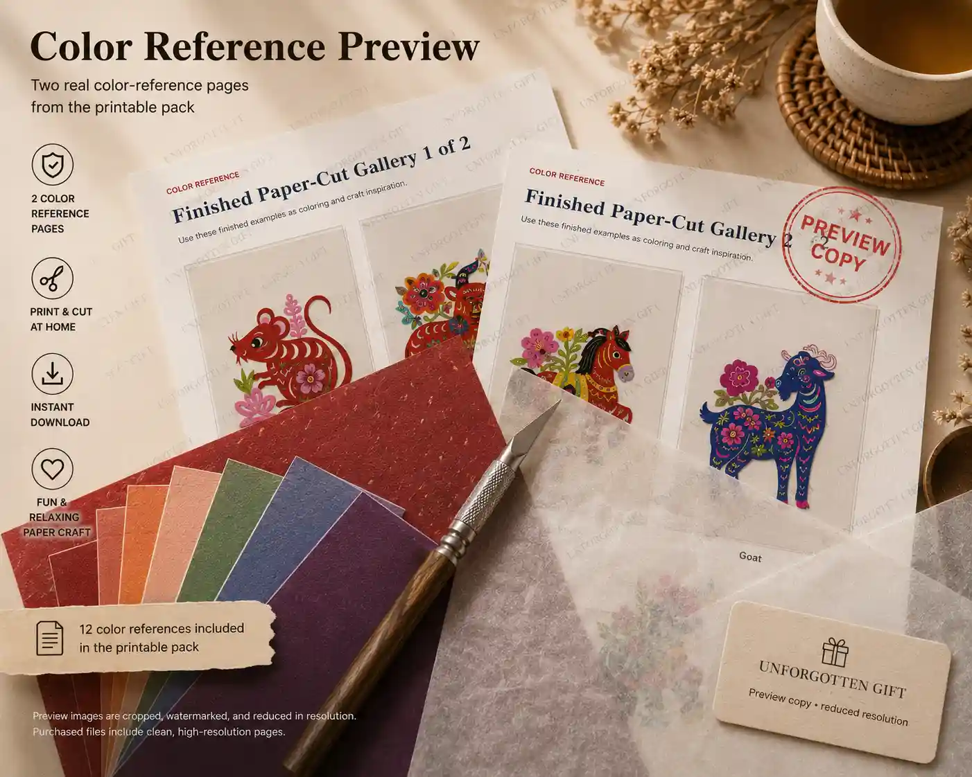
Test a palette with one free zodiac design, or use the complete set when you want all 12 animals formatted for A4 and US Letter.
Traditional Color, Regional Practice, and Modern Inspiration
Red is strongly associated with festive Chinese paper cutting, but Chinese paper-cut traditions are not limited to one color system. Regional practices, artists, materials, and uses can produce different approaches, including layered and colored work.
The palettes on this page are modern editorial suggestions for cards, gift tags, bookmarks, and small gifts. “Dunhuang-inspired” describes a contemporary color mood; it is not a fixed traditional paper-cut rule or a claim that the design is a historical Dunhuang original.
FAQ: Chinese Paper Cutting Ideas and Color Palettes
Is red the only traditional color for Chinese paper cutting?
No. Red is widely associated with festive paper cutting, but regional traditions and artists may also use multiple colors, painted details, layered paper, or different materials.
How many colors should a beginner use?
Two or three colors are usually enough: one main paper-cut color, one background, and one accent.
What background gives the strongest contrast?
Ivory, cream, pale gray, white, and rice-paper beige work well behind darker motifs. Dark navy or black can work behind pale motifs.
Which palette works best for small gift tags?
Use a high-contrast palette such as red on ivory, indigo on white, or black on beige. Small tags lose detail more quickly than large cards.
Can I use Dunhuang-inspired colors?
Yes. Ochre, teal, clay coral, muted green, and warm cream can create an artistic modern palette. Present it as inspiration rather than a fixed traditional paper-cut standard.
Which motifs are easiest for cards and bookmarks?
Simple butterflies, flowers, birds, leaves, border strips, and clear zodiac silhouettes are easier to place and read at a small size.
Can I use the free zodiac templates with these palettes?
Yes. Download one free animal, print a test copy, and use the palette as a guide for coloring, mounting, card stock, ribbon, or background paper.