Paper Cutting Color Guide

Chinese Paper Cutting Ideas for Cards and Gift Tags: 6 Color Palettes to Try

These Chinese paper cutting ideas are for anyone who has made a handmade card, gift tag, bookmark, or small gift detail and thought: “This looks empty. What can I add?”

The answer is not always a more difficult pattern. Sometimes, a simple paper detail looks more intentional when you use the right color palette: one main color, one soft background, and one small accent.

A simple 3-color rule for paper craft details
Main color Use this for the main paper, card base, or strongest visual area.
Soft background Use cream, ivory, beige, or white to make details easy to read.
Small accent Repeat one accent on the tag, envelope, ribbon, or message line.
You can use the palettes below for cards, gift tags, bookmarks, printable craft details, and small thoughtful gifts.
Quick answer

What Colors Work Best for Paper Cutting Cards?

For beginner paper cutting cards and gift tags, start with 2 to 3 colors: one main paper color, one soft background color, and one small accent color. This keeps the design clean while still making the card or tag feel finished.

The most useful Chinese paper cutting ideas for modern handmade gifts are not always red-only. Red is traditional and festive, but blue, ivory, gold, sage green, coral, black, and Dunhuang-inspired ochre can make a simple paper detail feel more modern, calm, or gift-ready.

Best beginner ruleUse one main color, one background color, and one tiny accent.
Best contrastDark paper on ivory or cream card stock is the easiest to read.
Best cultural touchUse Chinese-inspired palettes as a mood, not as heavy decoration.
Best for gift tagsSmall tags need stronger contrast than large cards.
Best for empty cardsUse one focal detail and repeat one accent color nearby.
Best product pathPrintable templates can help if you want a faster first version.
Chinese paper-cut is recognized by UNESCO as an intangible cultural heritage practice, and paper cutting is also introduced by the Smithsonian as one of China’s old and popular folk arts. For a broader cultural reference, see the UNESCO page on Chinese paper-cut and the Smithsonian overview of paper cutting.
Real beginner problem

Why Does a Handmade Card or Gift Tag Feel Empty?

Many beginner cards do not look empty because the paper cutting is wrong. They look empty because the design has no focal point, no contrast, or no color rhythm. A small paper detail can look thoughtful if the colors help guide the eye.

1
Too much blank spaceBlank space can be elegant, but only if there is a clear focal point. Add one paper detail near the center, corner, or message area.
2
The shape is too smallA tiny cut on a large card can disappear. Use a bigger detail, or repeat the same shape on the envelope or tag.
3
No contrastRed on red, cream on white, or soft colors on pale backgrounds can make the design look flat.
4
Too many colorsToo many colors can make a beginner design look busy. Start with three colors before adding more.
5
The tag feels functionalA plain tag only labels a gift. A small color detail makes it feel more personal.
6
The card and wrapping do not matchRepeat one color from the card on the gift tag, ribbon, envelope, or wrapping paper.
Simple fix: choose a paper shape first, then choose the background and accent colors. Do not start by adding decoration everywhere.
6 color palettes

6 Color Palettes for Chinese Paper Cutting Ideas

These six palettes are designed for handmade cards, gift tags, printable craft details, bookmarks, and small thoughtful gifts. Each palette gives a simple paper cutting idea a different feeling: festive, calm, artistic, natural, soft, or elegant.

Palette 1

Classic Red + Ivory + Soft Gold

01
Classic Red
Warm Ivory
Soft Gold
Deep Red

This is the safest palette if you want your paper cutting to feel festive, traditional, and easy to understand.

Best forBlessing cards, festive notes, traditional gift tags.
How to useUse red as the main detail, ivory as the card base, and gold as a small accent.
Avoid red-on-red layouts. Put red on ivory or cream so the paper detail stays readable.
Palette 2

Indigo Blue + White + Soft Gray

02
Indigo Blue
Soft White
Soft Gray
Deep Ink

This palette feels calm, modern, and less formal than red. It works especially well for bookmarks, minimalist cards, and quiet handmade gifts.

Best forBookmarks, calm gift tags, blue-white cards, minimalist handmade notes.
How to useUse indigo as the main color, white as the base, and gray for soft borders.
This is the best palette if you want a Chinese-inspired mood without making the design feel red or festive.
Palette 3

Dunhuang Ochre + Teal + Clay Coral

03
Dunhuang Ochre
Teal
Clay Coral
Warm Ivory

This is the most distinctive palette in the article. It gives simple paper craft details a warm, artistic, Chinese-inspired feeling without relying on red.

Best forArtful gift tags, cultural craft details, warm handmade cards.
How to useUse ochre as the warm base, teal as contrast, and clay coral as a small accent.
Do not use all three colors equally. Let ochre or teal lead, then use coral as the small “spark.”
Palette 4

Sage Green + Cream + Warm Brown

04
Sage Green
Cream
Warm Brown
Soft Linen

This palette is useful when you want paper craft to feel soft, natural, and handmade without looking too bright.

Best forNature-inspired cards, botanical gift tags, quiet handmade gifts.
How to useUse cream as the base, sage green as the main detail, and brown for string or handwriting.
This is a good palette for “I want it to feel handmade, but not too decorative.”
Palette 5

Peach Coral + Dusty Pink + Ivory

05
Peach Coral
Dusty Pink
Ivory
Muted Rose

This palette gives paper craft details a softer emotional tone. It works well for personal gifts, thank-you cards, and gentle birthday notes.

Best forThank-you cards, birthday notes, soft gift tags, personal messages.
How to useUse ivory as the base so coral and pink feel gentle instead of overly sweet.
Pair this palette with short handwritten messages. Too much decoration can make it feel sugary.
Palette 6

Ink Black + Rice Paper Beige + Warm Gold

06
Ink Black
Rice Beige
Warm Gold
Ink Brown

This is the most elegant palette. It feels mature and minimal, especially when used with silhouettes, simple borders, or calligraphy-style spacing.

Best forElegant gift tags, mature handmade cards, bookmarks, minimalist notes.
How to useUse black sparingly, beige as the main surface, and gold as a line, dot, or seal-like accent.
This palette works best when you leave more blank space. Let the contrast carry the design.
How to use them

How to Use These Palettes on Cards and Tags

The easiest way to use these Chinese paper cutting ideas is to treat color as a design system. Do not use every color everywhere. Give each color a job.

Step 1

Choose one focal detail

Use one simple paper detail as the main decoration. This prevents the card from becoming cluttered.

Step 2

Pick a quiet background

Ivory, cream, rice paper beige, pale gray, or kraft paper usually works better than a busy patterned background.

Step 3

Add one accent color

Repeat the accent on the envelope, ribbon, tag string, message line, or small corner detail so the design feels connected.

  1. For handmade cards, place the paper detail near the message area or in one strong corner.
  2. For gift tags, keep the contrast strong because small tags lose detail quickly.
  3. For bookmarks, use calmer palettes such as indigo, sage, cream, or ink black.
  4. For small gifts, repeat one color between the tag, wrapper, and card so the package feels intentional.
  5. For printable crafts, choose a palette before printing, cutting, or coloring so the set looks coherent.
If you need beginner-friendly shapes before choosing colors, start with these Chinese paper cutting patterns.
Avoid flat designs

Common Color Mistakes That Make Paper Cutting Look Flat

A paper detail can be simple, but it should not disappear. These mistakes are common when beginners decorate handmade cards or gift tags.

Mistake

Red on red

Traditional red is beautiful, but red paper on a red card can lose the details. Use ivory, gold, or beige behind it.

Mistake

Too many colors

If the card uses five or six colors, the paper detail may stop feeling special. Keep the palette tight.

Mistake

No focal point

A card can still feel empty if everything is scattered. Give the eye one main place to land.

Mistake

Background too busy

Patterned card stock can fight with the paper detail. Use calm backgrounds for small designs.

Mistake

Accent color missing

A tiny accent color can make the card feel finished. Use it on the message line, ribbon, or envelope.

Mistake

No link to the gift

If the card, tag, and wrapping have no shared color, the package can feel accidental instead of thoughtful.

Shortcut option

A Simple Starter Option for Cards, Tags, and Small Gifts

If you want to try this idea without drawing your own patterns, use printable details first. A small butterfly, bird, floral corner, bookmark strip, or gift tag can be enough to make a plain handmade card feel more personal.

Red + Ivory
Indigo + White
Sage + Cream
Ochre + Teal

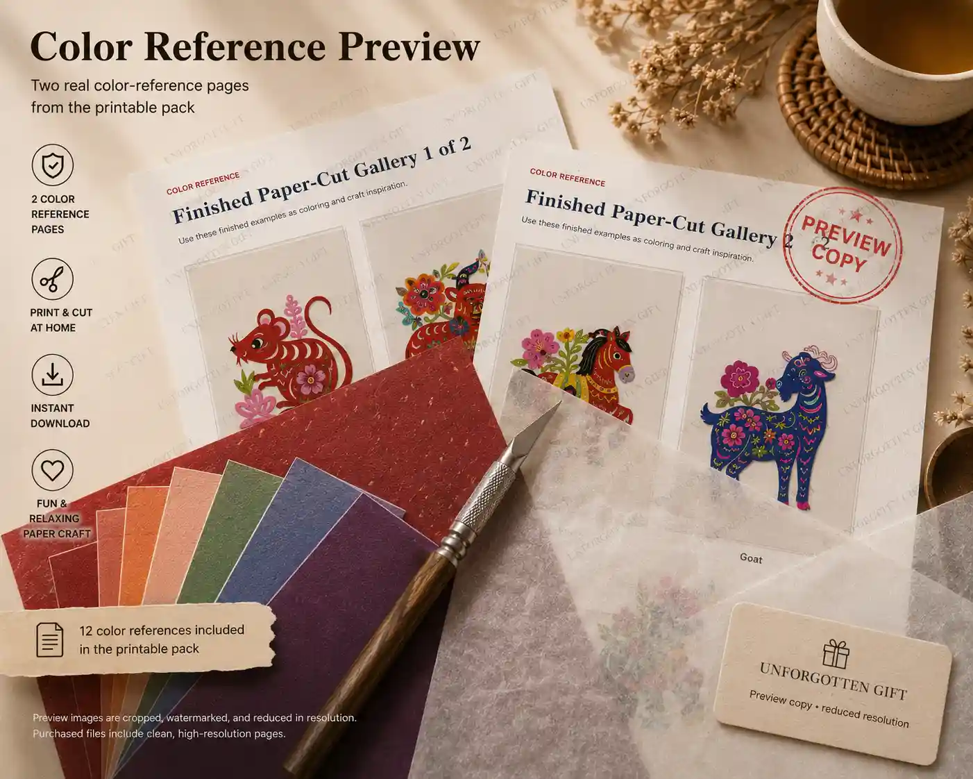
Printable Cultural Gift Craft Pack

Our printable cultural gift craft pack includes ready-to-print details for handmade cards, gift tags, bookmarks, and small thoughtful gifts. It is a shortcut if you want a beginner-friendly starting point before making your own paper cutting designs.

Use it with the color palettes above: print, cut, attach, then add your own handwritten message.

FAQ

FAQ: Chinese Paper Cutting Ideas and Color Palettes

What color is best for Chinese paper cutting?

Red is the most traditional and festive color, but it is not the only option. For modern cards and gift tags, blue, ivory, gold, sage green, coral, black, and Dunhuang-inspired ochre can also work well.

How do I make a handmade card look less empty?

Use one focal paper detail, choose a clear background color, and repeat one accent color on the envelope, ribbon, or gift tag. Do not fill every empty space.

What colors work well for paper cutting gift tags?

Gift tags are small, so contrast matters. Try red on ivory, indigo on white, black on beige, or ochre with teal accents.

Can I use Dunhuang colors for paper crafts?

Yes. Dunhuang-inspired ochre, teal, clay coral, muted green, and warm cream can make paper craft details feel more artistic and less generic.

Should paper cutting cards use many colors?

No. For beginner cards, 2 to 3 colors are usually enough. One main color, one background, and one accent will look cleaner than using too many colors.

What is the easiest paper cutting idea for beginners?

Start with simple shapes such as butterflies, birds, flowers, hearts, leaves, or corner borders. These are easier to place on cards, tags, and bookmarks.

Final thoughts

Final Thoughts

The best Chinese paper cutting ideas for cards and gift tags do not need complicated patterns. A simple detail can feel beautiful when the color palette is clear, the contrast is strong, and the design has a purpose.

Start with one focal detail, one quiet background, and one accent color. If your handmade card feels empty, do not add more random decoration. Add a clearer color system.

For a quick first project, try a printable detail from the Printable Cultural Gift Craft Pack, or explore more Chinese paper cutting patterns before choosing your palette.

Scroll to Top